An anime-inspired energy drink brand using bold design and Jujutsu Kaisen elements to engage Gen-Z consumers.

Created as a class project, the goal was to create branding and packaging design for a pop culture-inspired energy drink brand. I chose my favorite anime, Jujutsu Kaisen.
The challenge was to develop an energy drink brand that resonates with fans of Jujutsu Kaisen without using explicit imagery of the characters or logo.
Deliverables:
- Custom logo design
- Four can designs
- Box packaging design
Programs Used:
- Adobe Illustrator
- Adobe Photoshop
For the branding, I drew inspiration from the characters’ cursed energy powers, which reminded me of neo-tribal designs popular with Gen-Z. I also studied competitors like Red Bull, Monster, and Reign, noting their bold, striking logos that convey the drink’s intensity.

Starting from a neo-tribal sketch, I reshaped the typeface ‘Cyberpunks' in Illustrator and added cursed energy marks, creating a logo true to Jujutsu Kaisen and the energy drink market.


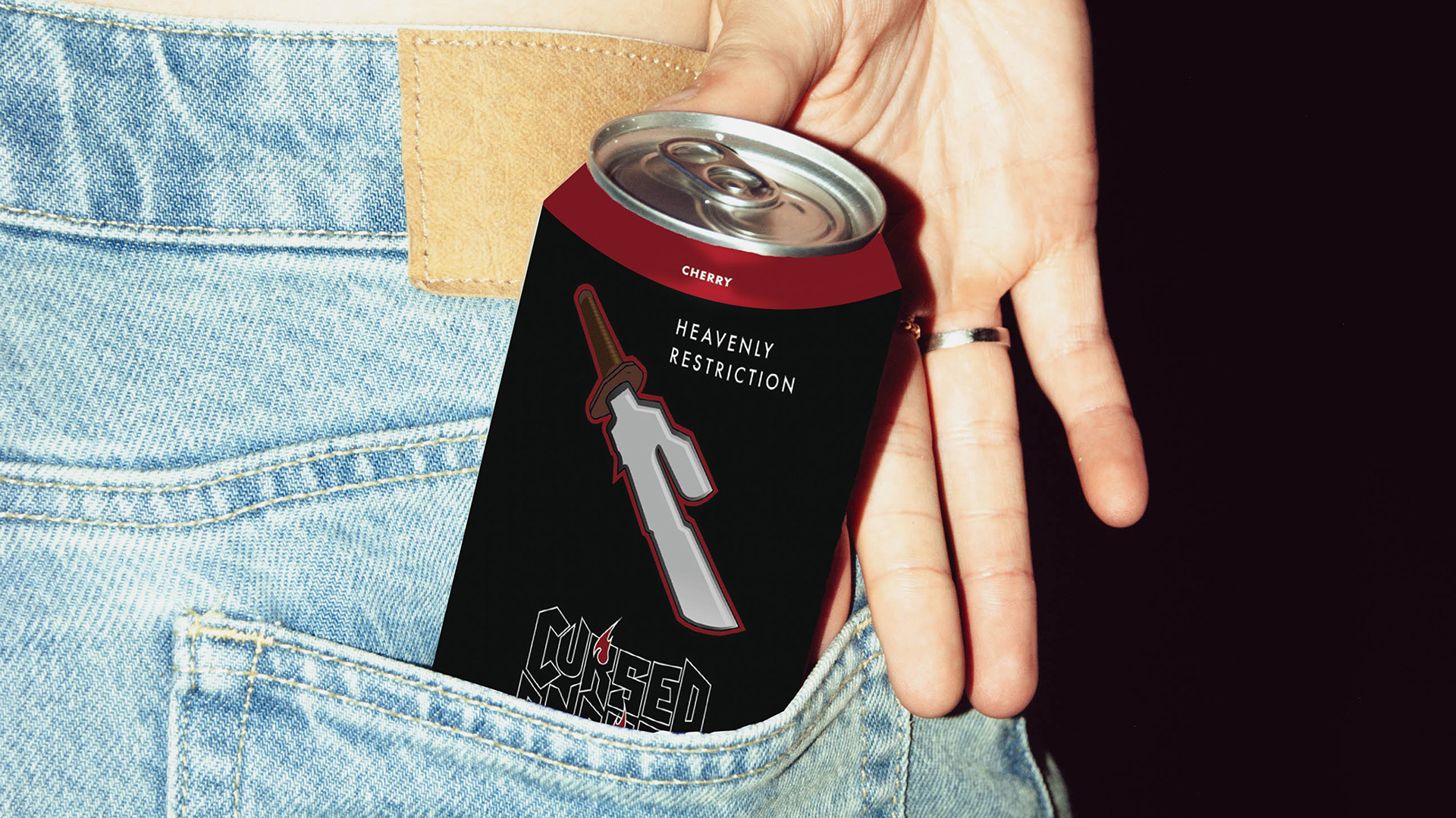
I created marketing asset including social media ads, a delivery truck wrap, and a subway poster campaign.


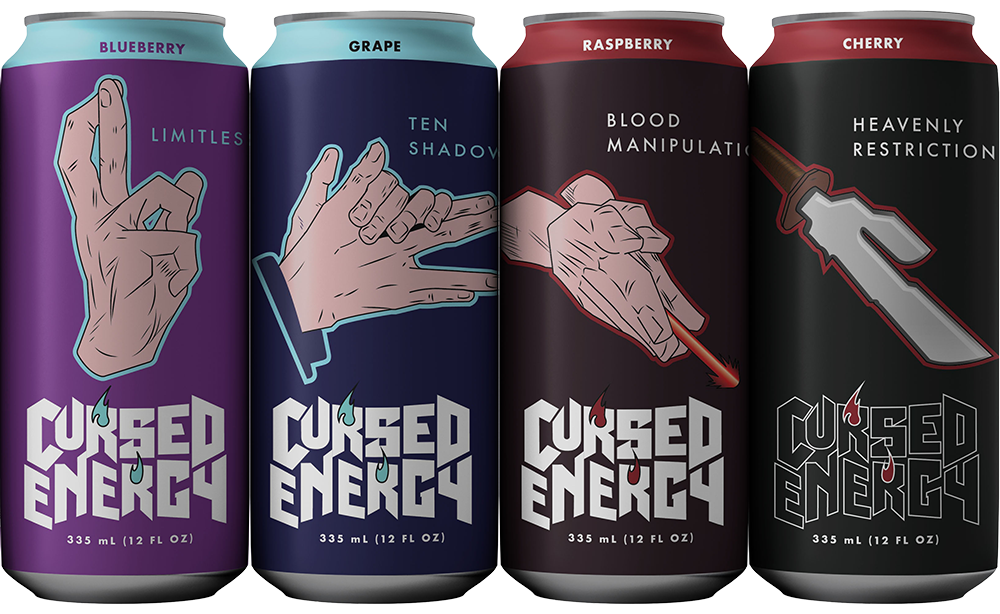
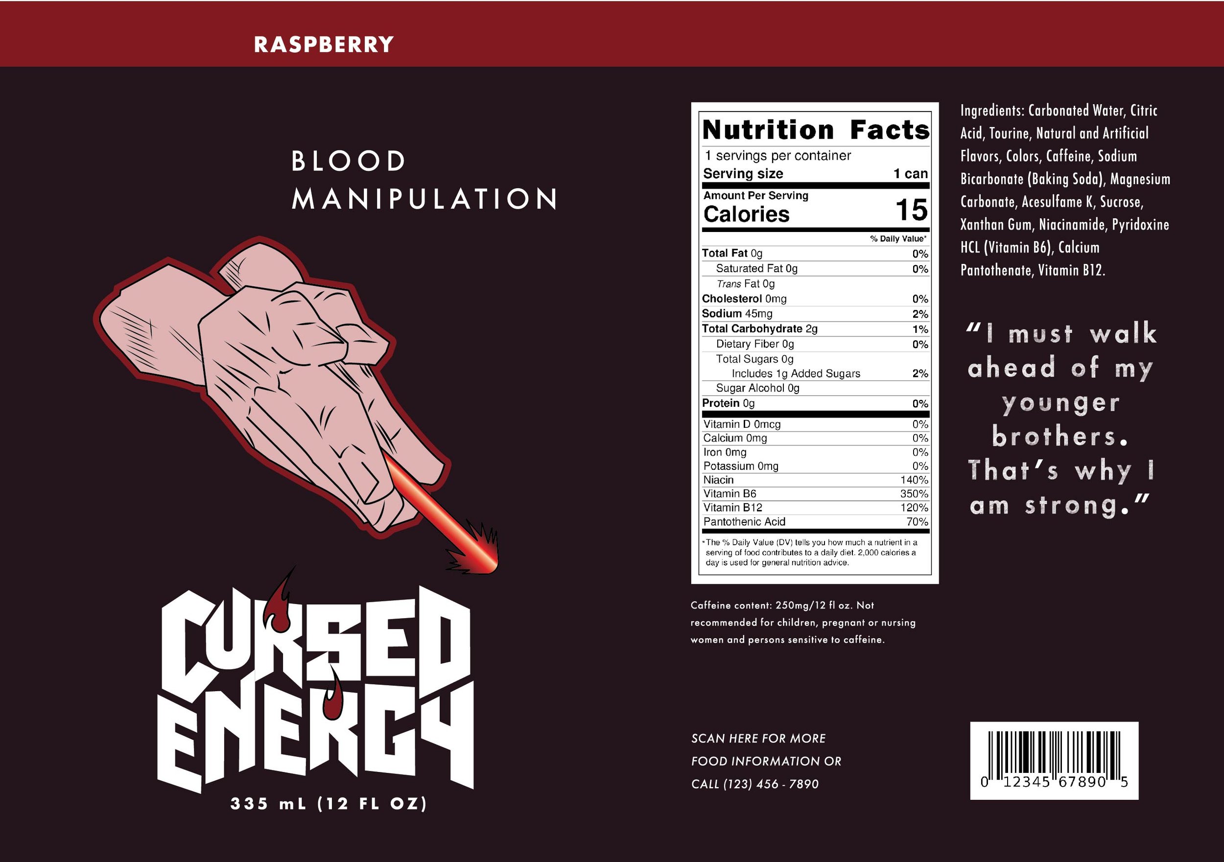
Using manga references, I created hand symbols in Illustrator, paired them with unique colors and names for each flavor, and ensured everything aligned with the brand identity.


Each flavor is inspired by a Jujutsu Kaisen character and their cursed technique, featuring hand signs, color schemes, and subtle visual references. Mockups created in Photoshop.