Crafting a full brand identity for an Orlando-based gastropub, blending speakeasy charm and minimalist design into an immersive experience.

Nestled in Historic Orlando, Pemburton’s Whiskey Alliance is more than just a gastropub — it’s an experience. Here, exotic burgers meet bespoke cocktails, offering a unique alternative to the traditional beer-and-burger pairing. Their primary audience is 60% female and 40% male, ages 25 — 34, seeking a captivating night out somewhere that's classy and upscale without being ostentatious.
Pemberton's is looking for a creative and trendy brand that captures the aesthetic of the speakeasy era and its customer's indie vibe.


.png)
For stationery and menus, I highlighted Pemberton’s antique speakeasy charm using a repeating Art Deco-inspired geometric pattern of golden circles for a minimalist, luxurious feel.


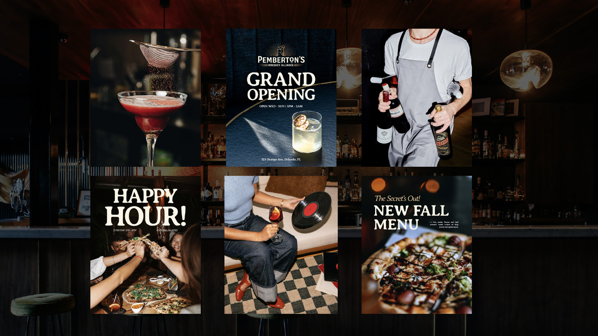
I designed social media assets for Pemberton’s Whiskey Alliance, showcasing cocktails, menu items, and brand personality to engage customers online.
Shown below are Pemberton’s homepage, reservation, and menu pages, featuring geometric borders and subtle logo layering to enhance vintage depth and texture.

