Riverside Art Center
Redesigning the website for a local art center to better connect the community with events, exhibitions, and the people behind them.
Project Overview
Located in Historic Downtown Wapakoneta, Ohio, the Riverside Art Center is dedicated to making art accessible and engaging for everyone. RAC primarily serves adults ages 25–50 who enjoy engaging with the arts on weekends or after work.
The Riverside Art Center needed a vibrant, user-friendly website that encouraged memberships and made it easy to find events, classes, and exhibits. I redesigned the RAC website focusing on navigation and clear content hierarchy using UX principles and responsive HTML/CSS code.
Understanding the Problem
I identified the following 5 pain points users faced when using RAC's original website:
1. Unclear Navigation
2. Content Overload
3. Non-Responsive Web Design
4. Lacking Event Details
5. Dated Visual Design
These questions led me to ask the question:
How can I create a clear, easy-to-use, and engaging website that helps users quickly understand and connect with Riverside Art Center?
Competitive Analysis
With this question in mind, I looked at other museum websites and noticed a pattern. They used CTAs and cards to display events details in a simple and concise way.


Branding
I was inspired by the Bauhaus art movement and RAC's roots in Wapakoneta, where the Auglaize River remains a natural landmark with deep roots in the community.

The Solution
To address these challenges, I’ve redesigned key aspects of RAC’s website with the user experience in mind. In the following sections, I’ll walk through specific features and design decisions — focusing on improved navigation, simplified content, mobile responsiveness, clearer activity promotion, and a refreshed visual layout that better reflects RAC’s mission and creativity.
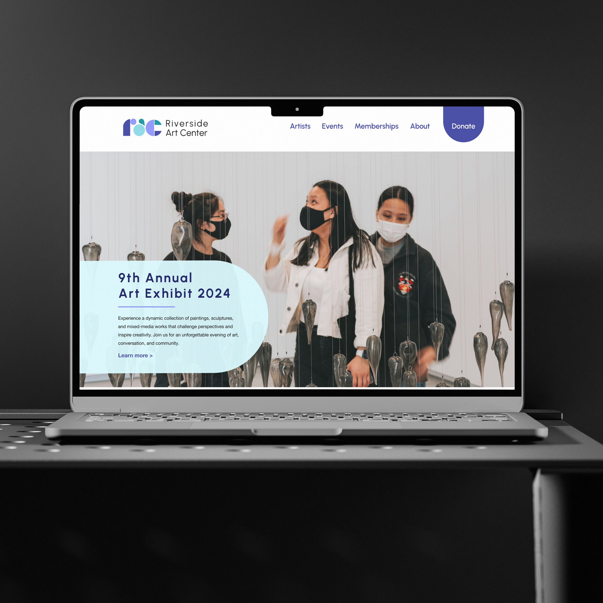
Landing Page Redesign


Events Page Redesign


About Page Redesign


Key Takeaways
This project helped me embrace a mobile-first approach in my design process. It was also my first experience using SCSS components, which streamlined development and sped up the build. Working with SCSS highlighted the value of design systems and how reusable components can make development more efficient and scalable.
Let's work together!
